
What a wonderful idea Natasha Davies came up with to CASE a Fellow AECP participant! When she suggested it, I immediately jumped at the chance. We were then paired up with a fellow creator and when I saw it was Shahina and her wonderful creations, I was very excited! This is a wonderful blog hop with so much inspiration, it will knock your socks off! If you had come from Nandini, you are in the right place!
In case you do not know what CASE means, there are two meanings, Copy And Share Everything is one but there is another meaning Copy And Selectively Edit which is what I will be doing in this post. It is when we are inspired by another creators work that we want to create something with that inspiration.
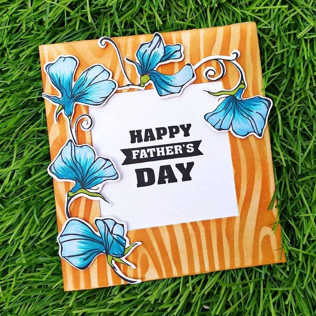
I went over to Shanina’s Instagram to find my inspiration. I was immediately drawn to the card below. I love its stunning and unique color palette!
When I do decide to CASE another creator, I used the the acronym C.A.S.E. to break down all the elements in thecard or project so it would be easier to me to “selectively edit”. The following are questions I ask myself when I plan to CASE a card for inspiration.
C – olor Palette
What are the dominant colors in the card? Are there any neutral colors? How about the color of the accents? In the card above, the dominant colors are Yellow/Yellow Orange and Blue. Its about 75% of the card. The neutral color is white and the accent color is black in the sentiment and there are touches of green.
A-pproach and/or Technique
What is the creator’s approach to the card? What is the concept? Is it a feminine, masculine or a gender neutral card? What techniques were used in creating this card? In this case, the card is a Father’s day card with floral elements. The technique on the background is ink blending with a stencil. The flowers surrounding the square die cut window is colored in with blue with markers. Her approach to the card is a gender neutral color palette of contrasting colors.
S-ketch
Card sketches are templates or layouts of a card to aid in inspiring creativity. I can CASE a card using the “sketch” as inspiration. The photo below is the sketch I made from Shahina’s card.

E-lements
What is the size/dimensions of the card? What are the main elements? What are the supporting elements? The card is square. The main elements are the stenciled wood grain background. She used the Sweet Peas stamp set for her floral element. The position of the flowers are coming from the bottom left, reaching over the top of the sentiment. The sentiment is a block-style.
Based on my C.A.S.E list above, I can choose which part of the card to copy. I can choose to just use the sketch, or I can choose the color palette and the elements. Or I can choose to copy everything and just eliminate one thing like the technique or the concept. The possibilities are endless!
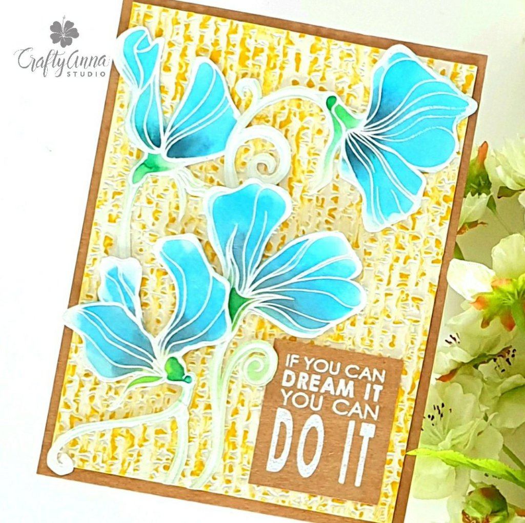
Here is my CASEd card!
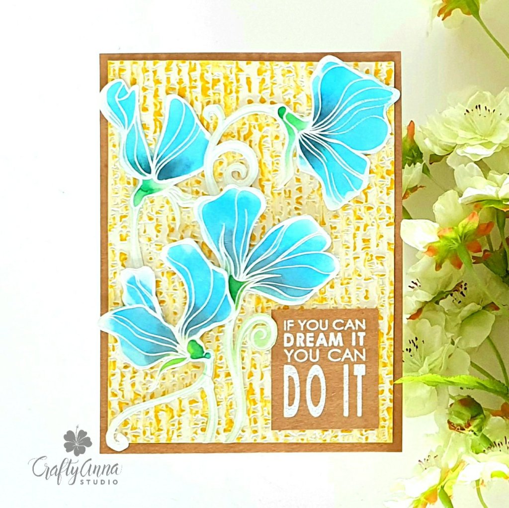
I chose to copy Shania’s color palette as this is one of the things that drew me to the card in the first place. Aside from the color palette, I also picked the same flowers from the Sweet Peas stamp set. Though I didn’t use a stencil for the background, I did use the same color as the backgound of her card. I also used a block-style sentiment.
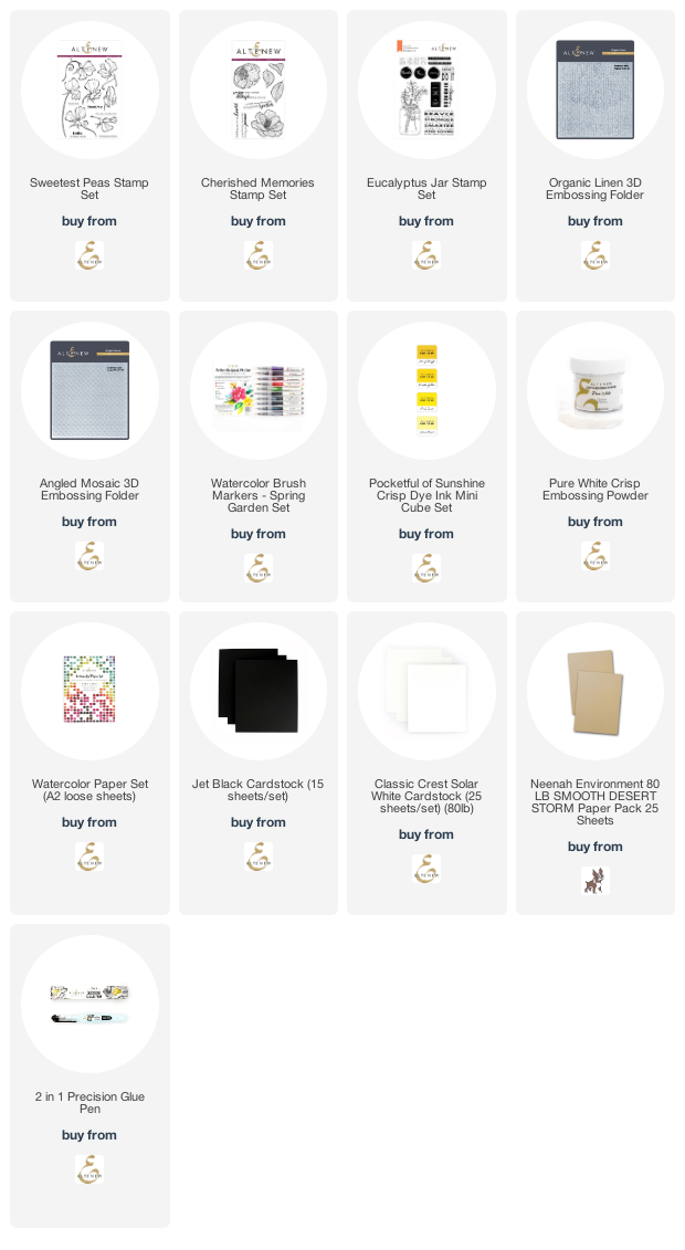
To create this card, I first stamped and white heat embossed the Sweet Peas flowers on a piece of watercolor paper and used waterbrush markers from the Spring Garden set – Sea Breeze and Dusk for the petals and Limeade and Emerald for the leaves and stems. I fussy cut them and set them aside while I worked on my background.
I took some cream cardstock and dry embossed it using the Organic Linen embossing folder. Then I took an ink cube in Honey Drizzle and swiped it across the embossed surface.
I cut it down to 4″X5.25″ and adhered it to a 4.25″X5.5″ kraft cardstock. I arranged the flowers in the same style as Shahina’s card with the flowers coming up from the bottom left up over the sentiment. I really like the unique way she laid out her floral elements.
The sentiment “If you can dream it You can do it” from the Eucalyptus Jar stamp set, heat embossed using crisp white embossing powder on kraft cardstock.
I had so much fun CASEing Shahina’s lovely creations! I decided to CASE another one! This is another gorgeous one I saw on her Instagram feed.
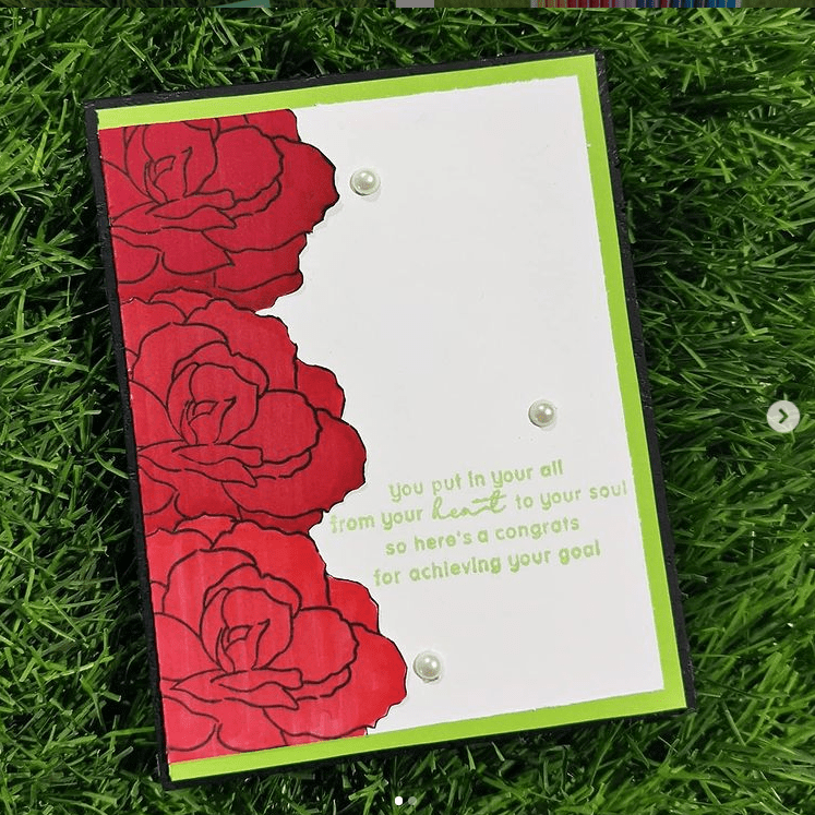
C-olor Palette
A bright red for the flowers. Bright green as an accent color used for the matting and the sentiment. The neutral color is the white background.
A-pproach
Card size is A2 size. The card style is a Clean & Simple, one-layer card (except for the pearl embellishments). Theme is a Congratulatory,
S-ketch
E-lements
Black Outline stamped flower on solid red cardstock. Sentiment is stamped on the background. Three flat back pearl embellishments.
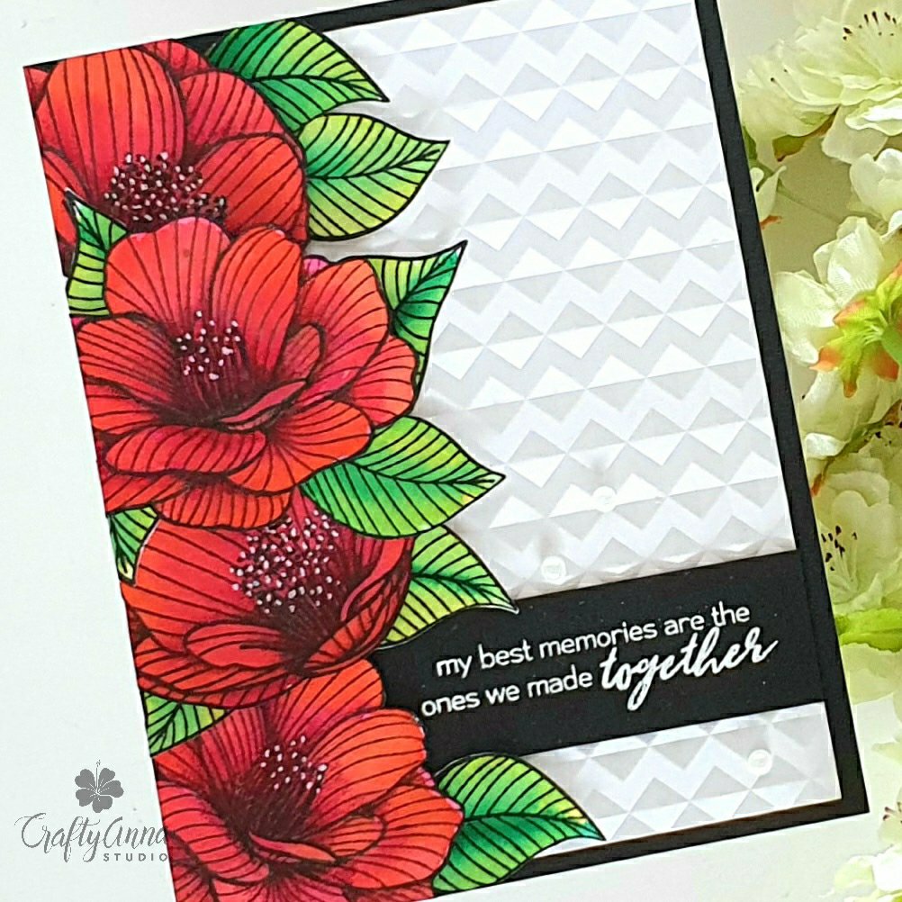
This is my CASEd card:
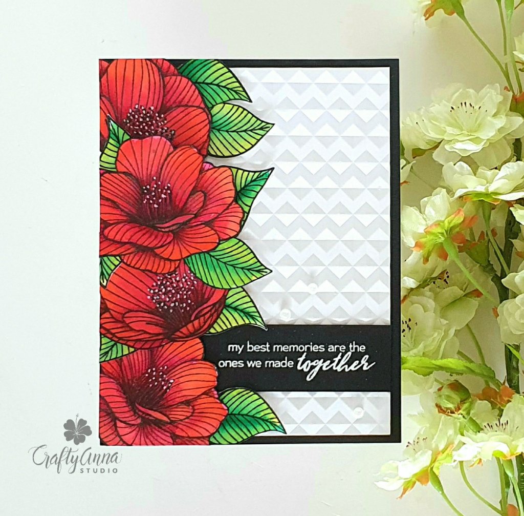
For this card, I CASEd her layout based on the sketch of her card. I also made color palette a dominant color of Red. The leaves of the flower are based on the accent color of the green matting on her card.
I stamped out the flowers from the Cherished Memories stamp set on watercolor cardstock using Obsidian Ink I colored them with waterbrush markers from the Spring Garden set – Rubellite and Autumn Blaze for the flowers, Limeade and Emerald for the leaves.
I fussy cut them out and adhered it to a dry embossed white card base using the Angled Mosaic Embossing folder. I adhered the flowers and leaves on the left side of the embossed panel, cut off the excess with my scissors. I added little white dots in the middle of the flowers using a white gel pen. I matted the whole panel on black cardstock.
I then white heat embossed the sentiment “my best memories are the ones we made together” on black cardstock, also from the Cherished Memories stamp set. I adhered it to the bottom of the card. I also used three flat back pearls as embellishment!
This was a lot of fun to do and very refreshing to find inspiration in other creator’s work. A big, huge thank you to Shahina for allowing me to showcase her cards.
Next on the hop is the wonderfully talented Natasha! Check out her amazing creations!
‘Til next time!
❤️
Anna
Thank you for visiting my blog. I truly appreciate it! You can also find me on Instagram, YouTube, Pinterest and Facebook.
Note: I am affiliated with some online stores including Altenew, Concord & 9th, Hero Arts, Brutus Monroe and Trinity Stamps. If you use any of the links above, I get a small commission from these wonderful shops at no extra cost to you. Thank you for your support!

Woww…Those cards are really stunning . Loved it to all bits. Great work Anna.
LikeLike
Thank you so much Shahi! I was really inspired! 💕
LikeLike
Woww…Those cards are really stunning . Loved it to all bits. Great work Anna.
LikeLike
Wow…2 beautiful cards! I especially love the second red floral! I think I may need that now after seeing your card!
LikeLike
Thank you Michelle!
LikeLike
WOW!! WOW! WOW!! Your approach is awesome and your designs even more amazing. Thanks for sharing these gorgeous makes and inspiring us Anna!
LikeLike
Thank you so much Sandhya!
LikeLike
What a CASE, not one but two…beautiful creations
LikeLike
Thank you so much!
LikeLike
Gorgeous cards, annamahtani ! They are both so beautiful!!
LikeLike
Thank you!
LikeLike
Beautiful cards. I love the colors and backgrounds and arrangements.
LikeLike
Thank you so much!
LikeLike
Very interesting break down, and lovely cards!
LikeLike
Thank you so much!
LikeLike
Both cards are beautiful! I love the textured background on the first one.
LikeLike
Thank you Jennifer!
LikeLike
Anna! As always you’ve blown me away with your stunning cards and meticulous attention to detail!
I can’t decide which of your cards I love the most, they are both so gorgeous!!! 😍❤
Also, your breakdown of the term CASE is incredible!!! If anyone ever asks me what this means again in the future than Imma point them right to you my friend!!!! 🤩👏👏👏
Thank you so much for joining this hop! 😀
LikeLike
Thank you my dear friend! And for organizing this amazing hop! Bravo!!
LikeLike
wow, absolutely amazing cards
LikeLike
Thank you so much Neha!
LikeLike
Como decimos nosotros los mexicanos, te aventaste! Te salieron hermosas! 💜 Warm greetings from San Antonio, Texas, where it snowed 5 inches for the first time since 1985! We are freezing our booty off. haha haha ❄❄❄
LikeLike
Thank you so much! Stay warm and be safe!
LikeLike
Very pretty cards!
LikeLike
Thank you Nancee! 💕
LikeLike
Thank you Nancee!
LikeLike